
Behind the build
Behind the build: how Tenshio designs responsive digital products
Responsive design is not the final step of shrinking a desktop screen. It starts by deciding what each user needs at each device size.

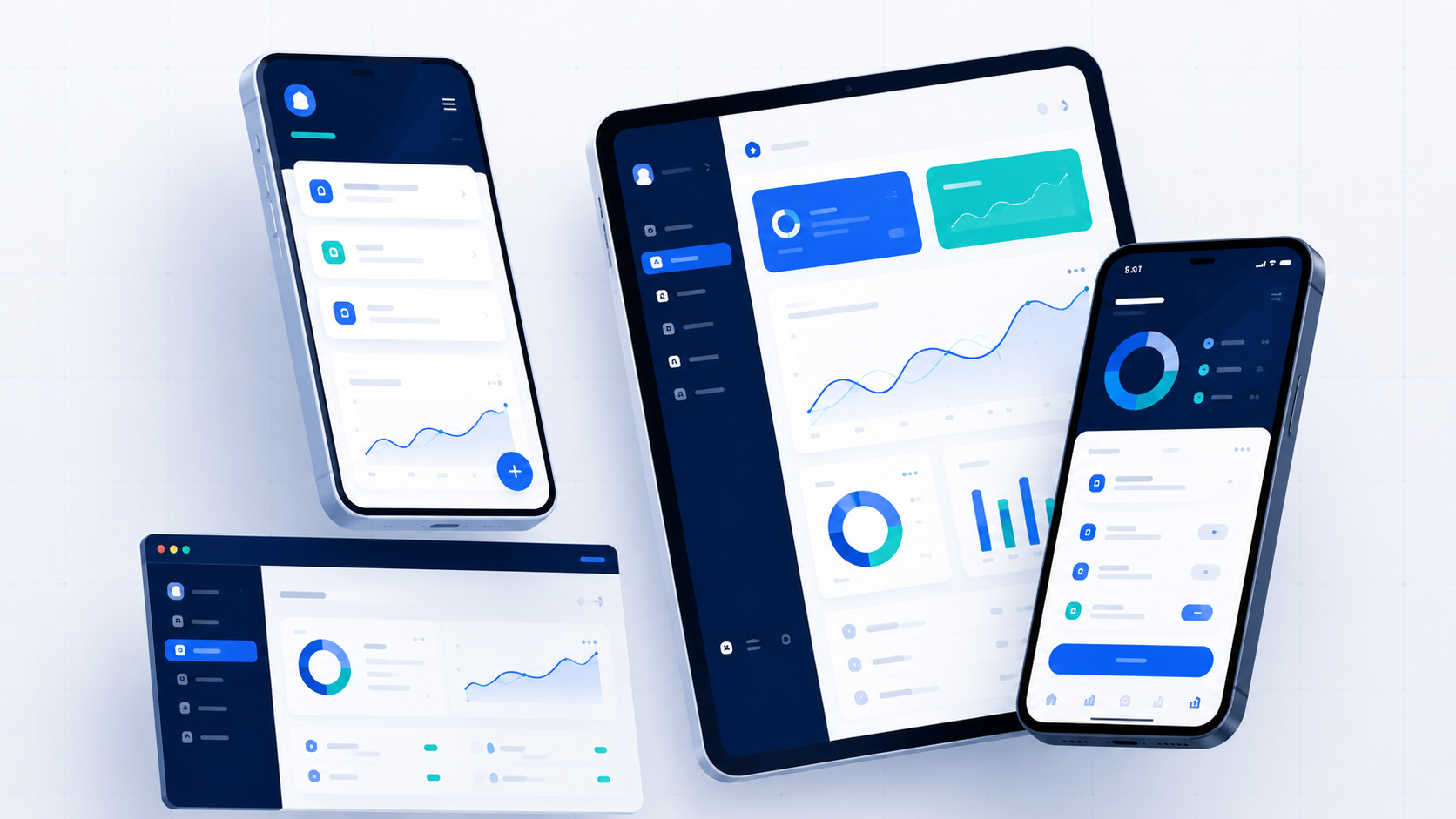
Tenshio approaches responsive design as a product decision, not a collection of late CSS fixes. The same information and actions may need different hierarchy, density, and navigation on a phone, tablet, laptop, and large desktop.
This process is used across websites, web systems, and native Android products.
Start with the user task
Before choosing columns or breakpoints, identify the main task on the screen. A quotation form, dashboard, calculator, service page, and media gallery each require a different responsive strategy.
Define the content hierarchy
The most important information should remain visible and understandable at every size. Secondary controls can move, collapse, or appear later, but they should not disappear accidentally.
Design phone and larger layouts intentionally
- Phone layouts prioritize sequence and touch comfort
- Tablet layouts use additional width without merely stretching controls
- Laptop layouts keep content compact enough for common working screens
- Large displays add breathing room without making text lines difficult to read
Test real states, not only ideal screenshots
- Long names and descriptions
- Validation and error messages
- Empty, loading, and offline states
- Large lists and dense data
- Keyboard and safe-area behavior
- Different image proportions
Keep implementation connected to design
When the same person or closely connected workflow handles planning, interface decisions, and development, visual intentions are less likely to be lost during implementation.
Practical takeaway
Responsive quality comes from prioritization, real-state testing, and device-aware layout decisions—not from scaling one finished desktop screen down at the end.
Continue reading
Related guides
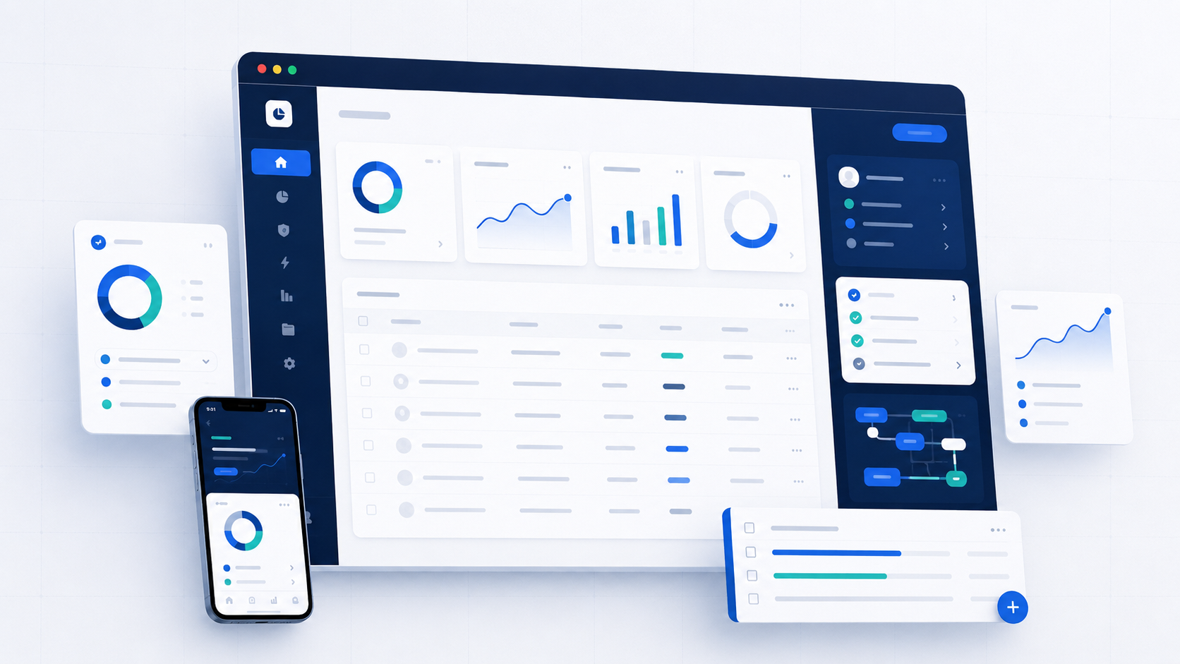
When should spreadsheets become a custom web system?
Spreadsheets are useful until duplicated files, manual approvals, weak permissions, and difficult reporting begin to slow the business down.
Read guide